Peter Valdemar Mørch
2015-05-29 09:38:24 UTC
Hi,
I'm looking for a little inspiration and experience here.
We have a customer that has about 400 interfaces and he'd like to get an
overview of "How these interfaces are doing". When there are more than
about 15-20, looking at each individual graph simply brakes down.
My user wants an idea of what the "normal" situation is, and information
about the worst outliers / extreme cases.
Looking at average and standard deviation is a possibility, but most of my
users (and I) really have no good intuitive feeling for what standard
deviation really "means". Plus "outlier/extreme" information is lost.
I've seen that smokeping does something interesting, see e.g.
Loading Image...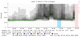
The "historgram" approach where darker grey implies more datapoints in this
"region" could be cool. This gives the overview. Have no idea how this is
accomplished, though.
I was thinking of using a "histogram" approach like above overlayed with
showing the actual graphs of the N worst outliers/extremes. But that
implies lots of scripting and analysis to create the histogram (I'm
guessing) and to identify the outliers.
So: What have you guys done when creating an overview of many statistics?
I'll leave you with this picture from the gallery:
Loading Image...
This is exactly the situation I want to avoid....
Sincerely,
Peter
I'm looking for a little inspiration and experience here.
We have a customer that has about 400 interfaces and he'd like to get an
overview of "How these interfaces are doing". When there are more than
about 15-20, looking at each individual graph simply brakes down.
My user wants an idea of what the "normal" situation is, and information
about the worst outliers / extreme cases.
Looking at average and standard deviation is a possibility, but most of my
users (and I) really have no good intuitive feeling for what standard
deviation really "means". Plus "outlier/extreme" information is lost.
I've seen that smokeping does something interesting, see e.g.
Loading Image...

The "historgram" approach where darker grey implies more datapoints in this
"region" could be cool. This gives the overview. Have no idea how this is
accomplished, though.
I was thinking of using a "histogram" approach like above overlayed with
showing the actual graphs of the N worst outliers/extremes. But that
implies lots of scripting and analysis to create the histogram (I'm
guessing) and to identify the outliers.
So: What have you guys done when creating an overview of many statistics?
I'll leave you with this picture from the gallery:
Loading Image...
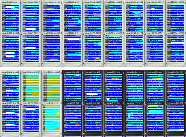
This is exactly the situation I want to avoid....
Sincerely,
Peter
--
Peter Valdemar MÞrch
http://www.morch.com
Peter Valdemar MÞrch
http://www.morch.com